Local Business Glow Up Series Part 1
Part One: Reimagining a takeaway fish and chip shop.
There’s something iconic about a local fish and chip shop.
The smell of hot chips near the water. The regular customers who’ve been coming for years. The kind of place that becomes part of the town itself.
But while the food might still be great, many older takeaway brands begin to feel visually dated over time and that impacts how customers perceive the business before they even order.
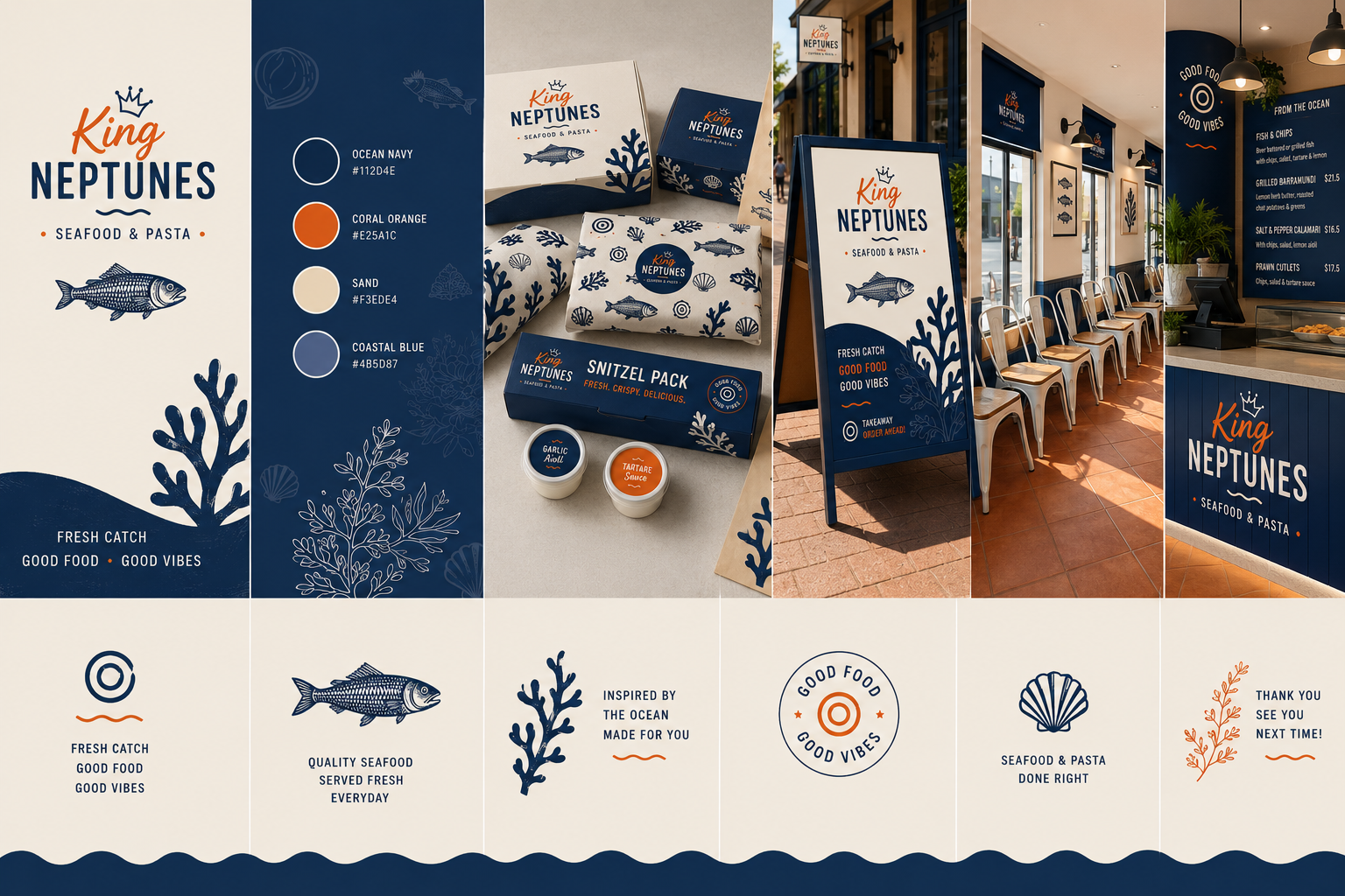
This concept rebrand for King Neptunes is Part One of my Local Business Glow Up Series, where I reimagine existing local businesses through strategic branding, packaging, signage and customer experience design.
The Vision
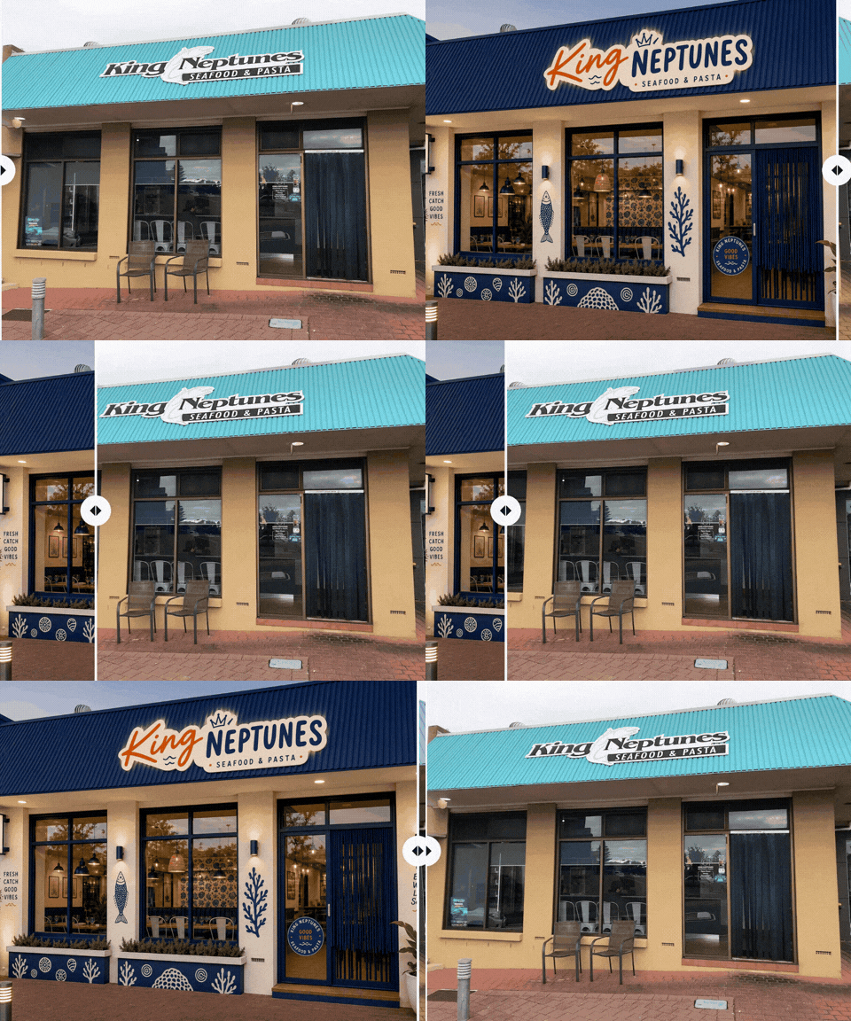
The goal wasn’t to turn King Neptunes into a luxury restaurant.
It was about transforming it into a cool, modern coastal takeaway that still felt approachable, affordable and local.
Inspired by Mediterranean fish markets, vintage seafood packaging and playful coastal illustration styles, the concept combines:
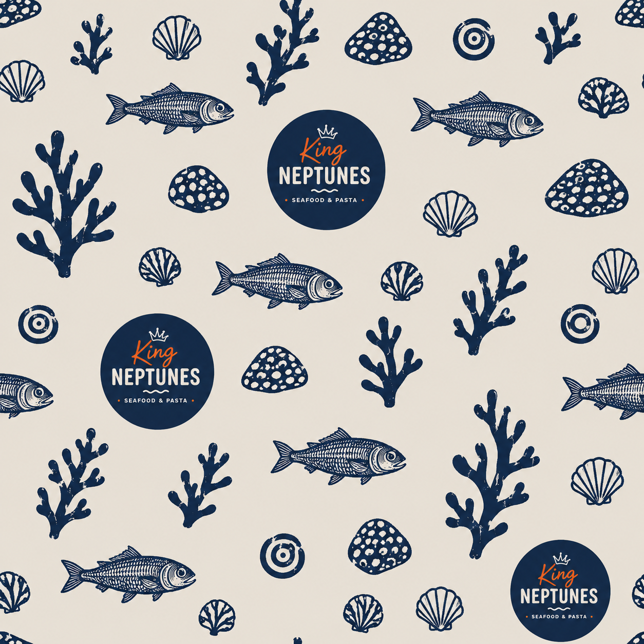
hand-drawn seafood graphics
modern typography
coastal-inspired colours
takeaway-focused branding
cohesive packaging
updated signage
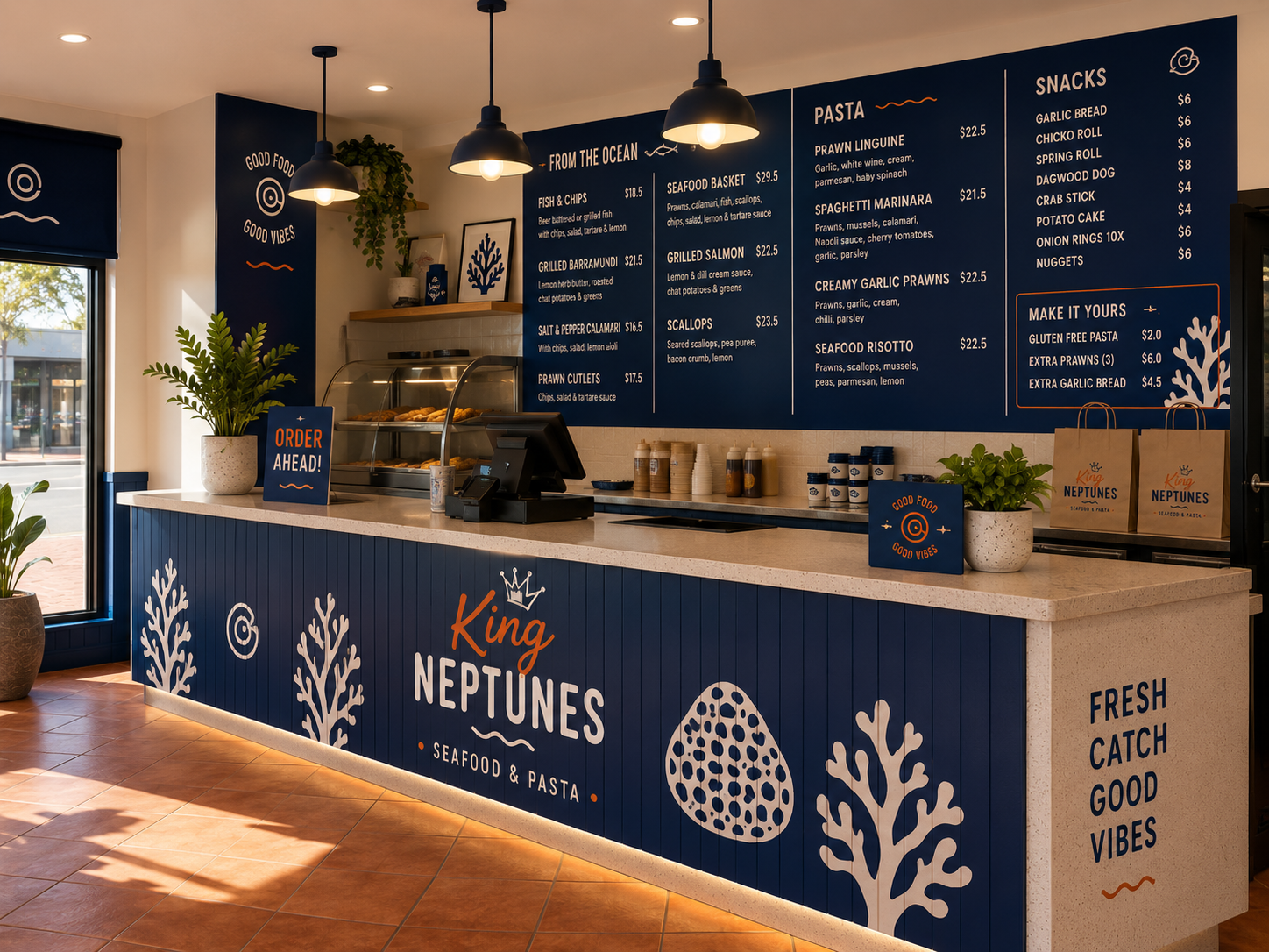
refreshed interiors
The result feels much more memorable, modern and social-media friendly while still staying true to the original business.
Why Branding Matters
Branding is not just a logo.
It shapes:
first impressions
customer trust
brand awareness
social media presence
packaging
menus
signage
interiors
customer experience
Once the branding direction is established, every other decision becomes easier because everything starts working together cohesively.
The fit-out feels intentional.
The packaging becomes recognisable.
The menus feel polished.
The social media becomes more consistent.
Strong branding creates consistency and consistency builds trust.
And trust leads to sales.
The Transformation
For this concept, the original branding was completely modernised with:
a fresh new logo system
custom seafood-inspired illustrations
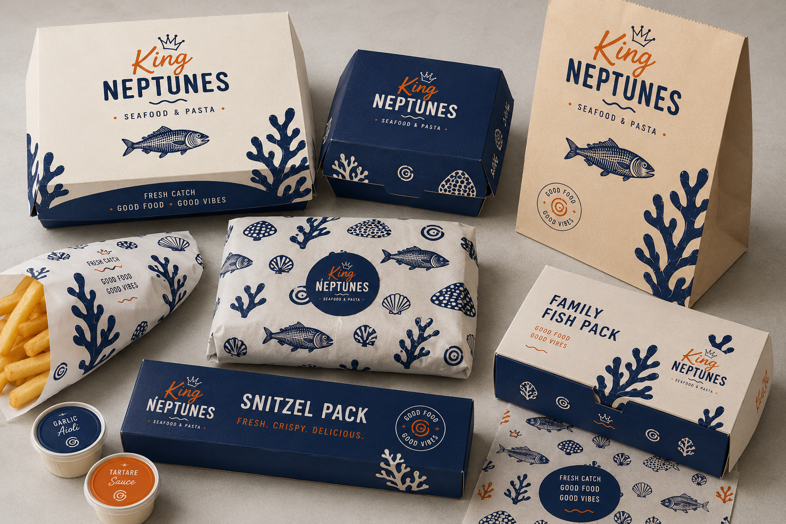
branded wrapping paper
takeaway packaging concepts
schnitzel pack boxes
updated facade visuals
coastal-inspired signage
interior styling ideas
takeaway menus
A-frame concepts
The entire concept was designed to feel playful, fresh and instantly recognisable.
The Power of Packaging
Packaging is one of the most underrated branding tools for takeaway businesses.
It’s often the first physical interaction customers have with your business and it can completely change how your brand is perceived.
Even something as simple as custom wrapping paper or a well-designed takeaway box can instantly make a business feel more premium and memorable.
For King Neptunes, the packaging direction became a huge part of the overall identity and helped tie every touchpoint together.
Using AI in the Creative Process
This project was also a fun exploration into combining traditional branding strategy with AI-assisted mockups.
The strategy, typography, colours and creative direction still come from me and my creative brain but AI helps bring the visual concepts to life much faster, especially for:
facades
signage
interiors
packaging
environmental branding
Once the vision is clear, the execution process becomes incredibly streamlined.
Final Thoughts
A business doesn’t always need a full renovation to feel brand new.
Sometimes a refreshed identity and cohesive visual direction can completely transform how customers experience a business.
Good branding helps local businesses:
stand out
become more memorable
increase trust
improve customer perception
support stronger sales and growth
And most importantly, it helps businesses feel proud of how they show up in the world.
Disclaimer
This project is a conceptual design exercise created as part of my Local Business Glow Up Series.
It is not affiliated with or commissioned by King Neptunes